Edgars Creek Primary School
Marketing, Social Media Content Creation, Photography, Branding, Filming and Editing
Overview
Edgars Creek Primary School required a refreshed brand identity and a more engaging digital presence to better connect with its growing school community. I led the redevelopment of the school's social media strategy, creating visually engaging content that aligned with the school's values and strengthened its online identity.
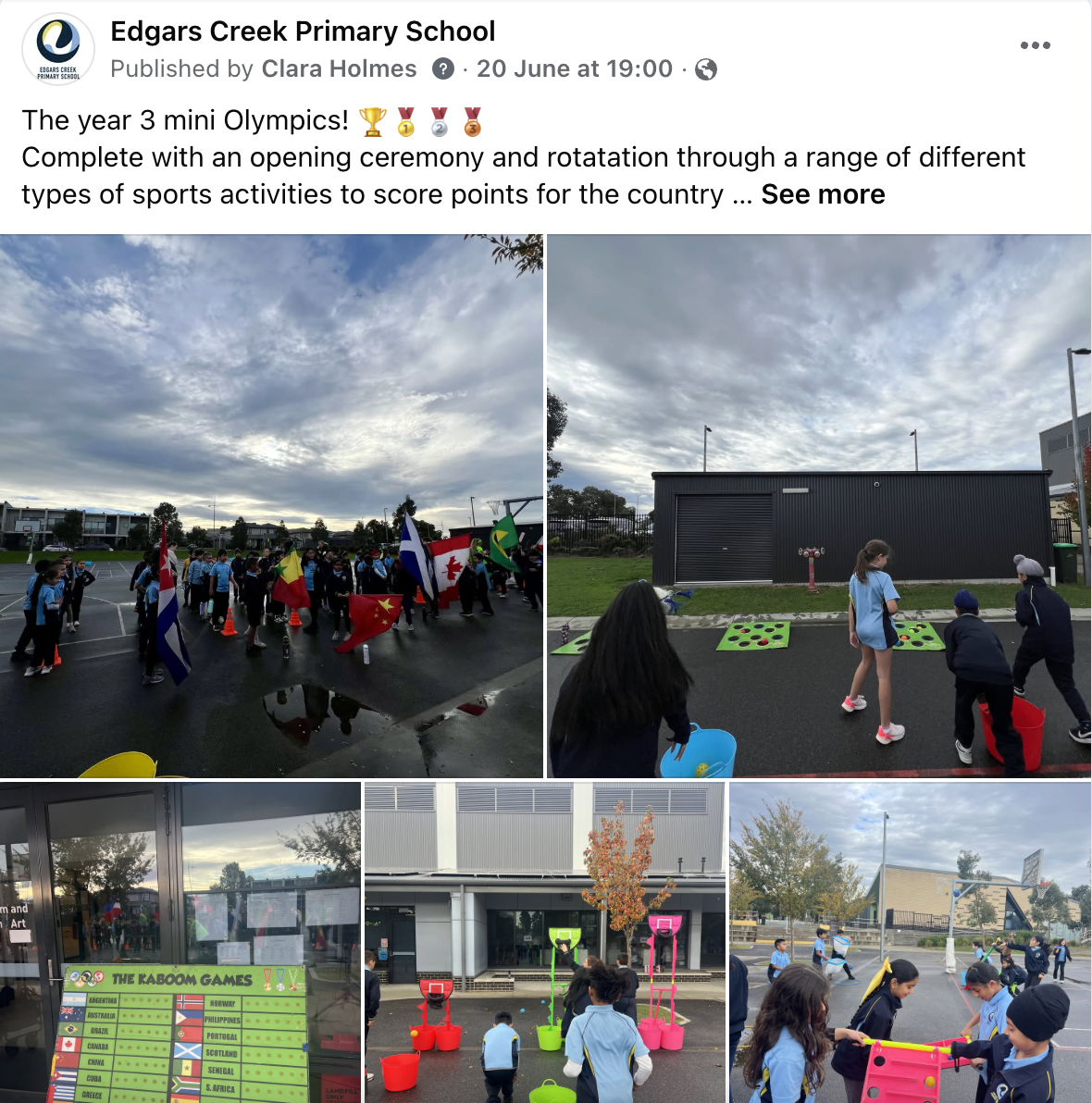
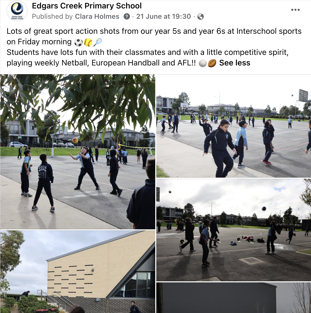
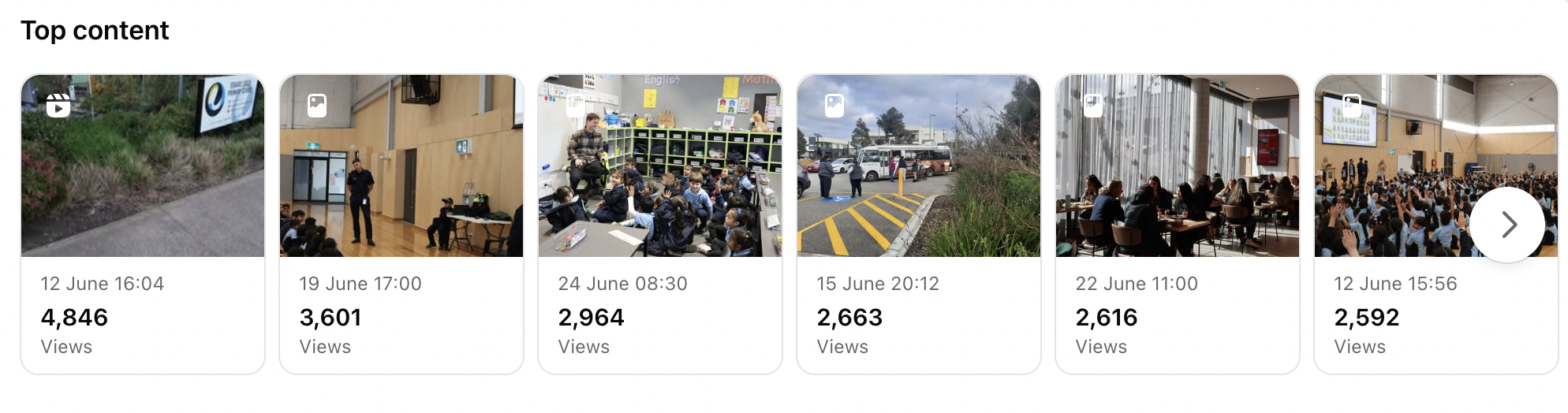
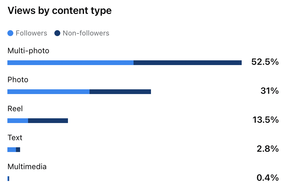
As the primary manager of the school's Facebook page, I oversee the entire content creation process—from planning and capturing photography to designing graphics, writing content, scheduling posts, and monitoring engagement. Through a consistent visual style and strategic storytelling, the page has experienced significant growth, with post views increasing by over 86% and continuing to rise with each new piece of content published.
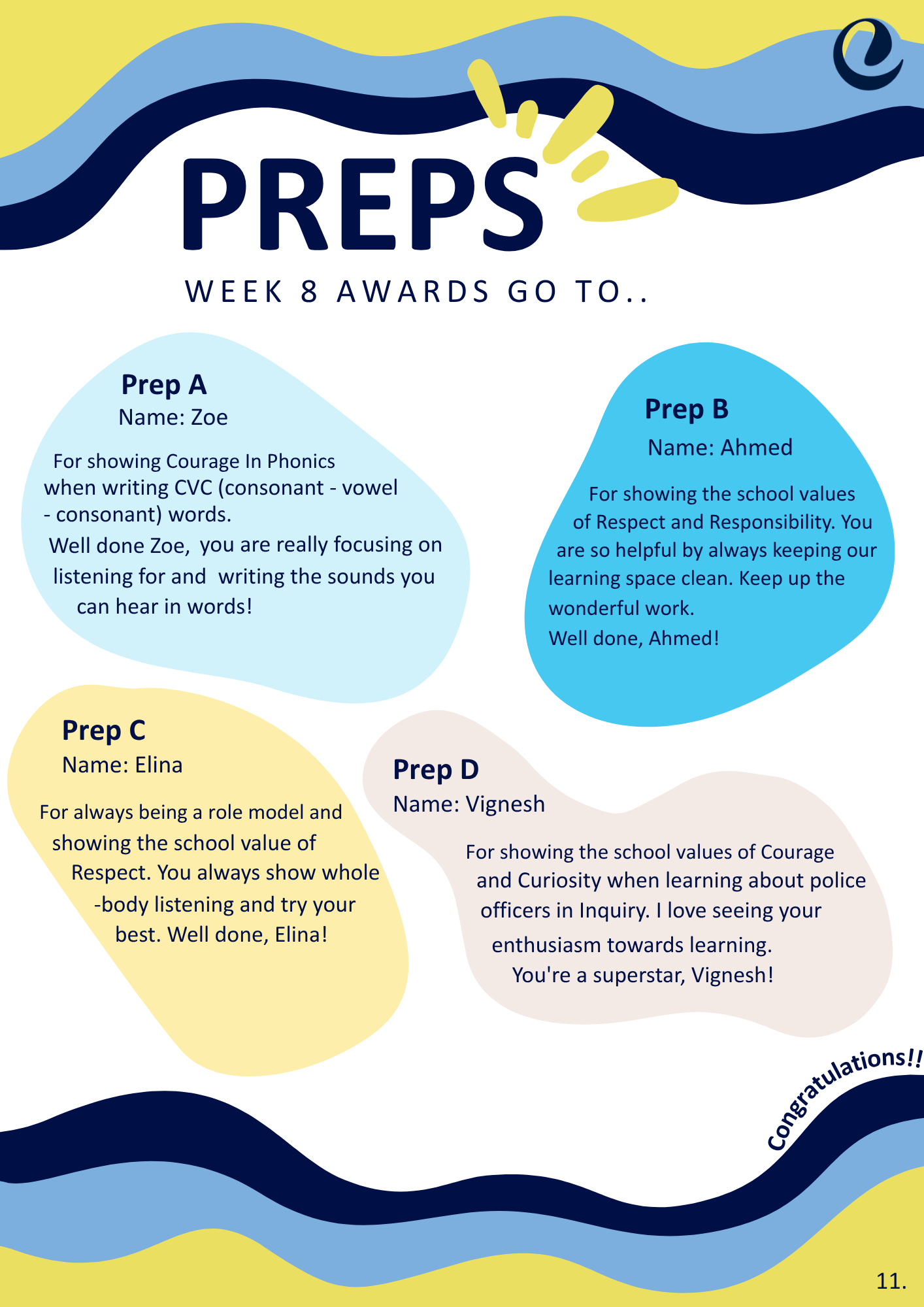
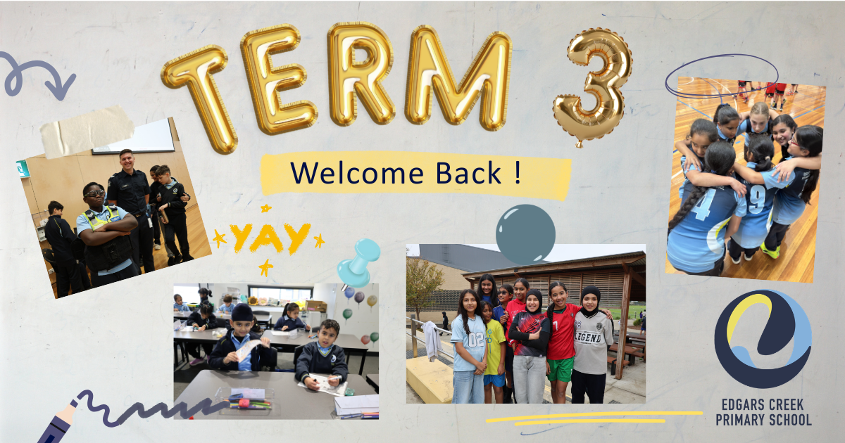
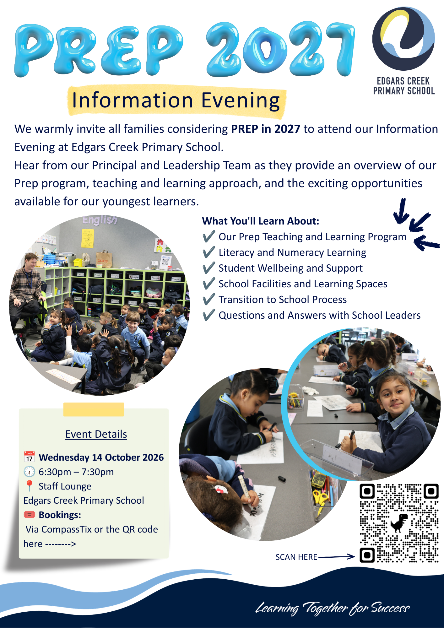
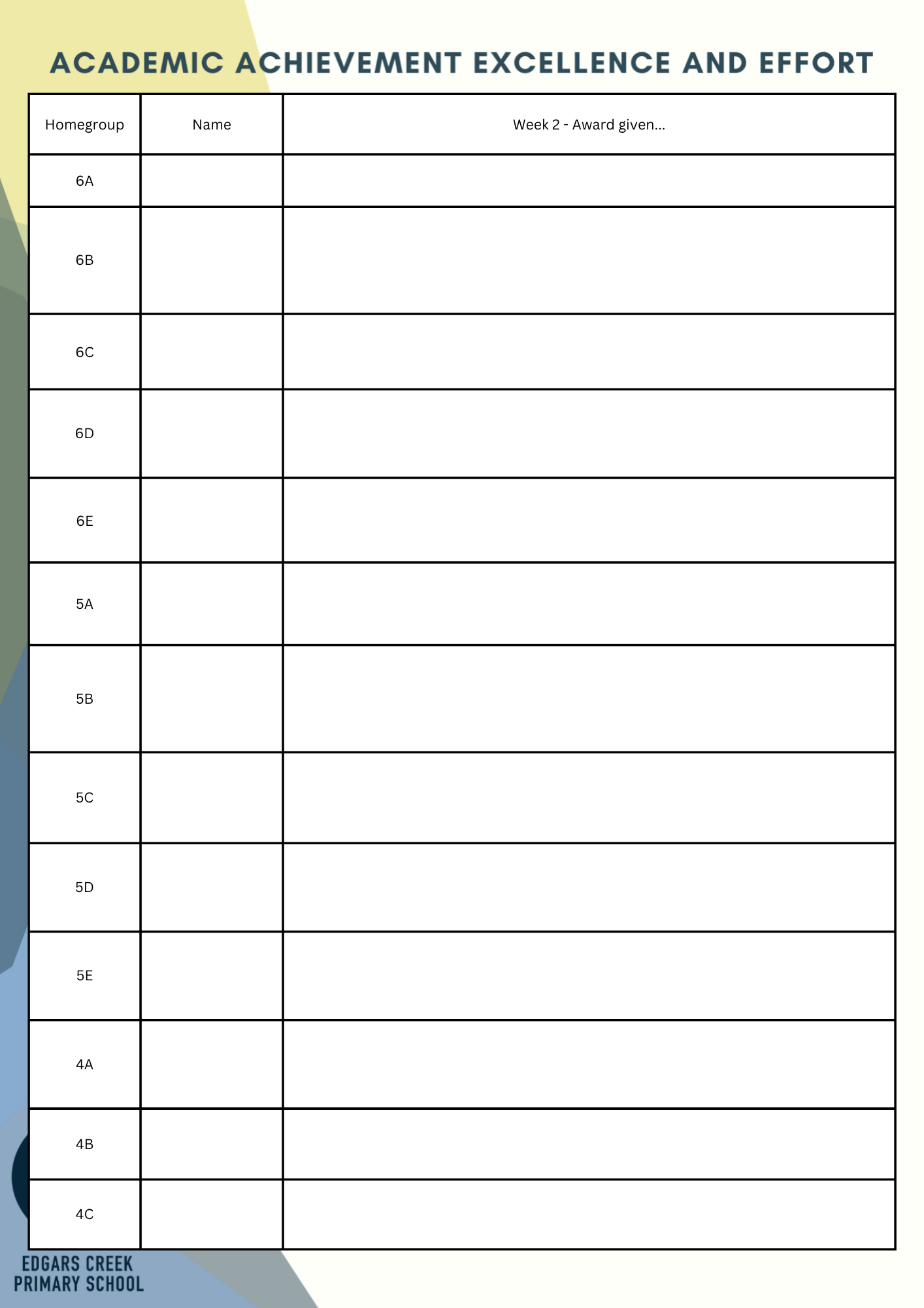
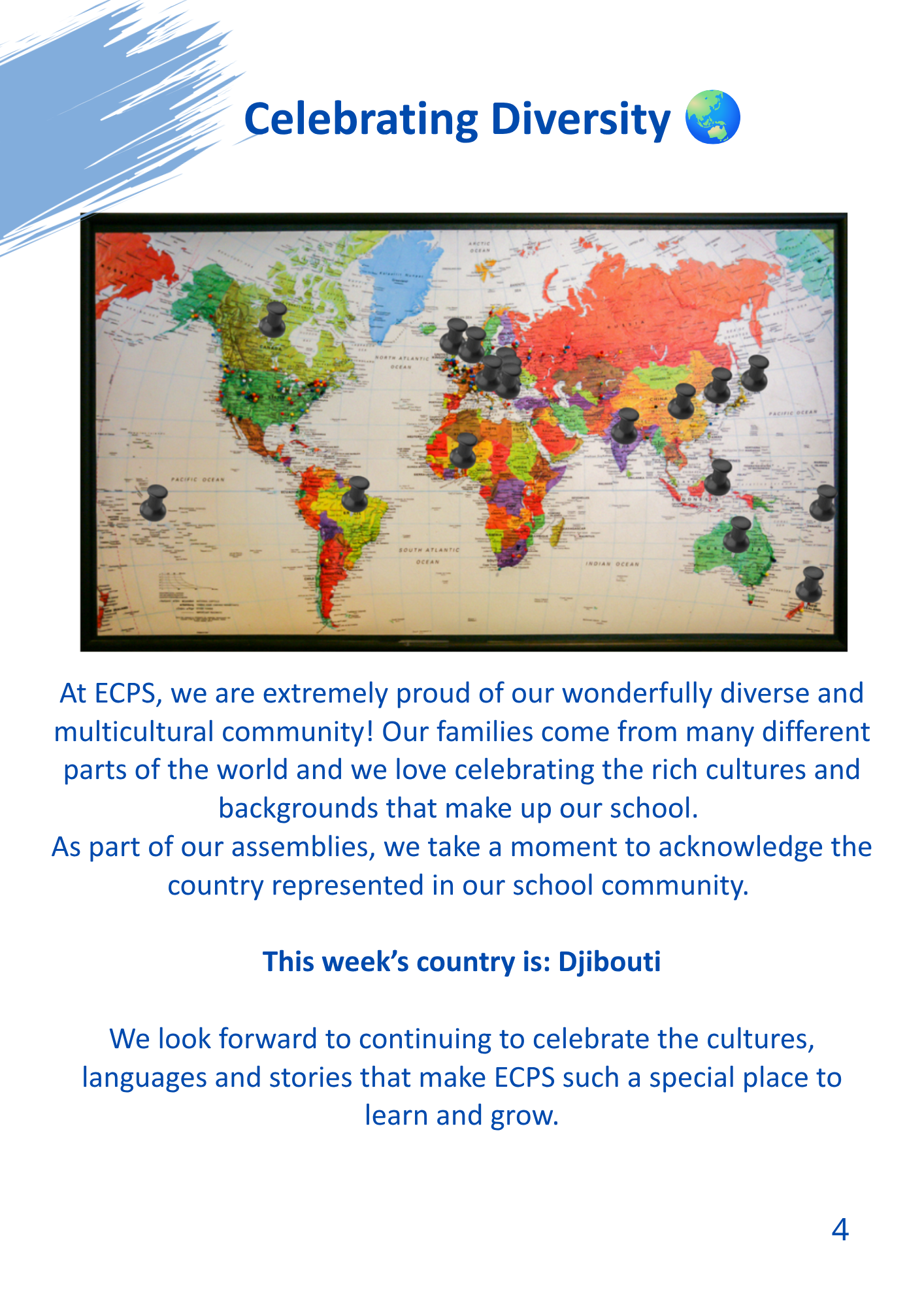
Here is a link to a newsletter that shows new Edgars created brand identity created and designed with more visually engaging content.





Alongside social media management, I contribute to the ongoing development of the school's website, ensuring branding, messaging, and user experience remain consistent across all digital platforms. This project highlights my ability to combine photography, graphic design, content strategy, and web design to build stronger community engagement and create meaningful digital experiences.
Services: Brand Refresh, Social Media Management, Photography, Graphic Design, Website Development
Results: 86% increase in Facebook post views, improved community engagement, and a stronger, more cohesive digital brand presence.
The Brief
The brief was to retain Edgars Creek Primary School’s existing colour palette while creating a stronger and more cohesive visual identity across all promotional and digital materials. Existing communications lacked consistency, with different layouts, styles, and graphic elements being used across platforms, which made the brand feel fragmented. The goal was to establish a clear visual system that could be applied consistently across social media, print collateral, website content, and school promotions.
My inspiration came directly from the school’s name and its surrounding environment. With the nearby creek being a defining local feature, I developed a concept centred around the movement and flow of water. I introduced a series of organic, fluid shapes that echo the natural curves of a creek and used these forms as a recurring graphic element throughout the design system. These flowing shapes guide the eye through each composition, create visual continuity between pages and posts, and give the brand a distinctive identity that is both recognisable and meaningful to the school community.
Because the audience is primarily children and families, it was important that the visual language felt welcoming, energetic, and engaging. I balanced the established school colours with playful layouts, dynamic imagery, and soft organic forms to bring a sense of life and fun back into the communications while still maintaining a professional and trustworthy appearance.
The outcome was a refreshed design system that allows the school’s logo, colours, and visual elements to flow consistently across every touchpoint. The redesigned materials create a unified brand presence, improve recognition across the community, and provide a flexible framework for future promotional content. My work below showcase the original materials alongside the redesigned versions I created to demonstrate the transformation and the improved consistency achieved through the rebrand, and the Facebook content I have designed.